What can be achieved with GRPlot?
Plot kinds
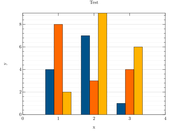
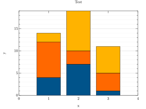
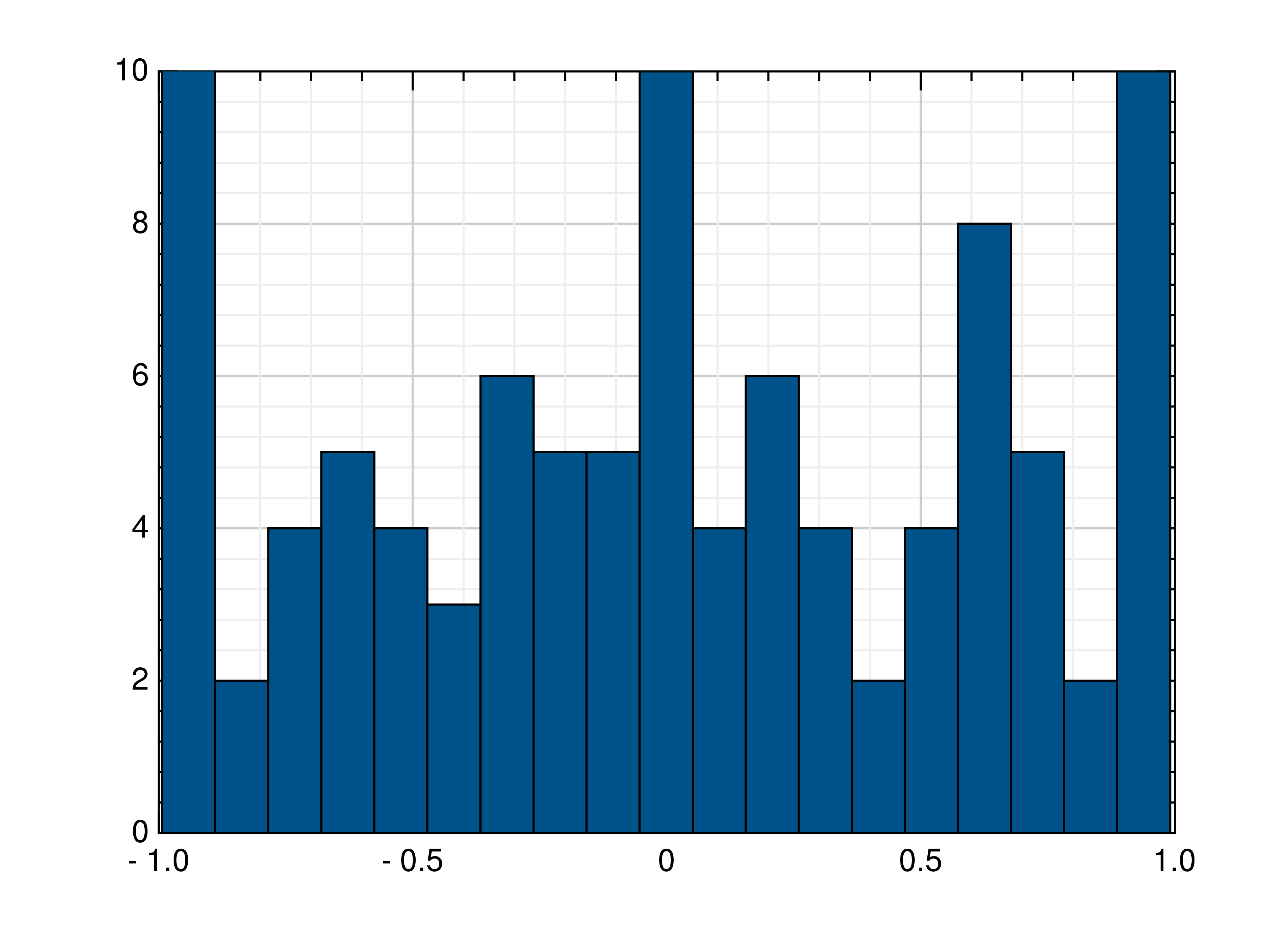
barplot
A bar plot is used to display the relation between a numeric variable and a categorical variable. The resulting bars
represent the frequency or quantity of the different data categories. It can be easily created from the command line by
setting the kind to barplot. The style key thereby defines how the bar plot series are placed next to each
other, out of three possible options. The left one uses the lined option, while the right one uses the stacked
option. The following example uses the barplot data file. More information’s about the format of these files can be
found under data_file.
grplot barplot.dat kind:barplot style:lined
Additional key-value pairs can be included in the data header. The x- and y-columns parameter defines which columns are used for the x- and y-data.
# title : Test
# x_label : x
# y_label : y
# x_columns:1
# y_columns:2,3,4
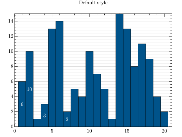
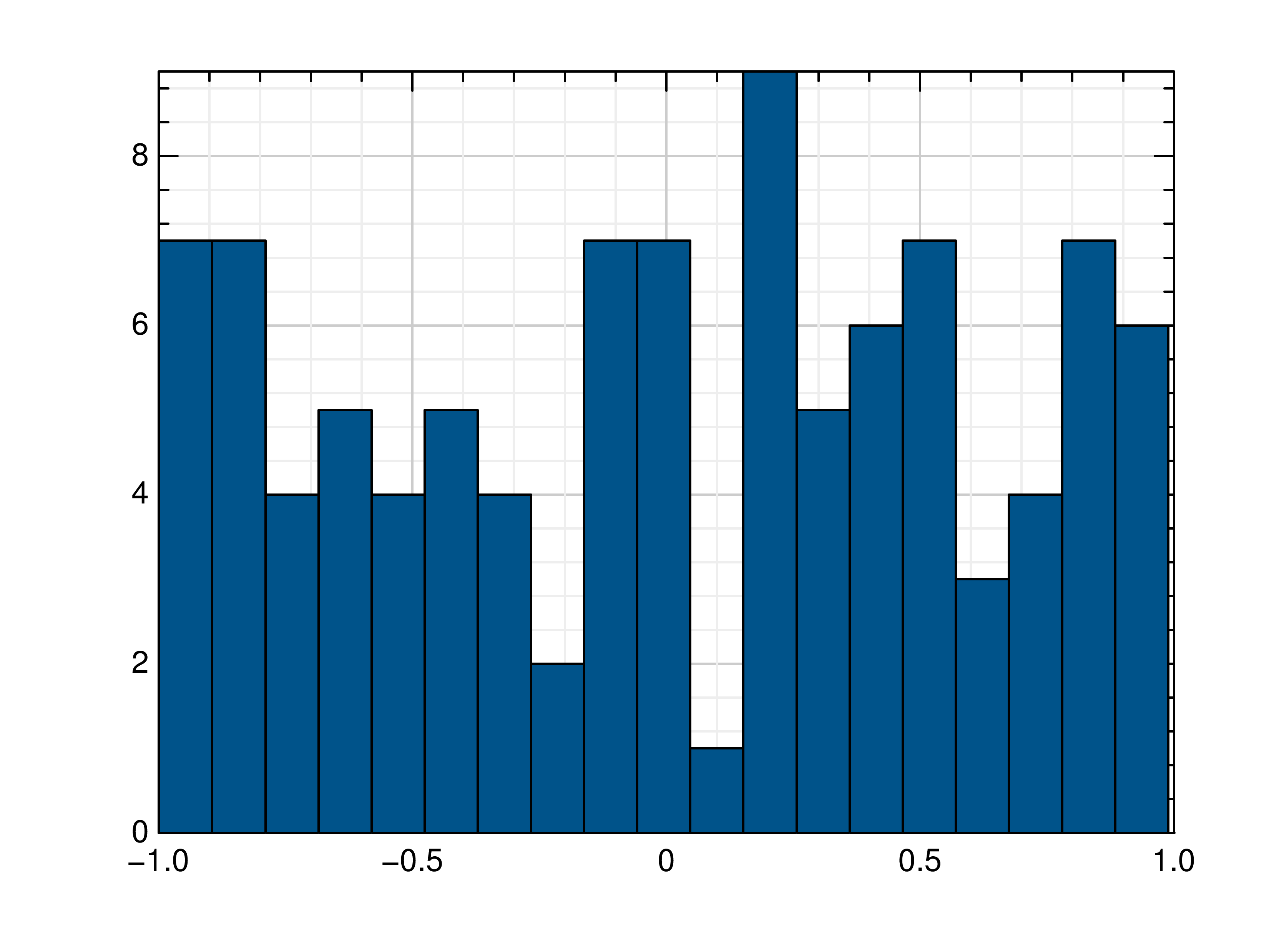
Another example is a default bar plot that includes the bar_width parameter, which is used to adjust the width
of the bars. In this case the barplot2 data file is used.
grplot barplot2.dat kind:barplot bar_width:1
Additional key-value pairs are included in the data header. The y-labels are applied to specific bars, while the leading number indicate how many labels there are.
# title : Default style
# y_labels : 7,6,10, ,3, , ,2
Following parameters can be used:
bar_color, bar_width, bottom, columns, edge_color, edge_width, error, error_bar_style, error_columns, error_type, equal_up_and_down_error, file, grplot, ignore_blank_lines, join_plots, kind, left, orientation, right, style, title, top, twin_x, twin_y, x_flip, x_grid, x_label, x_lim, x_log, x_range, xye_file, y_columns, y_flip, y_grid, y_label, y_labels, y_lim, y_log, y_range
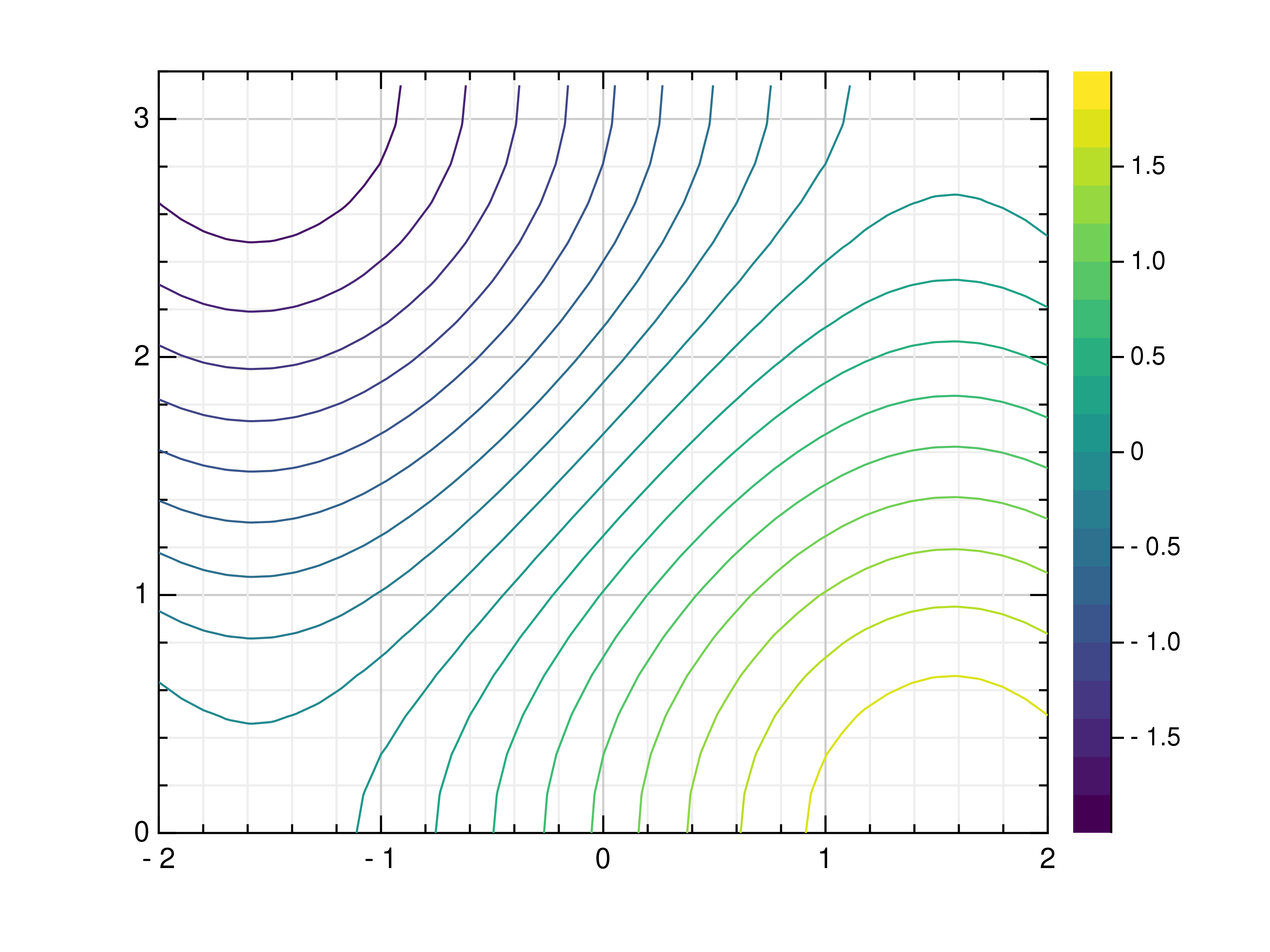
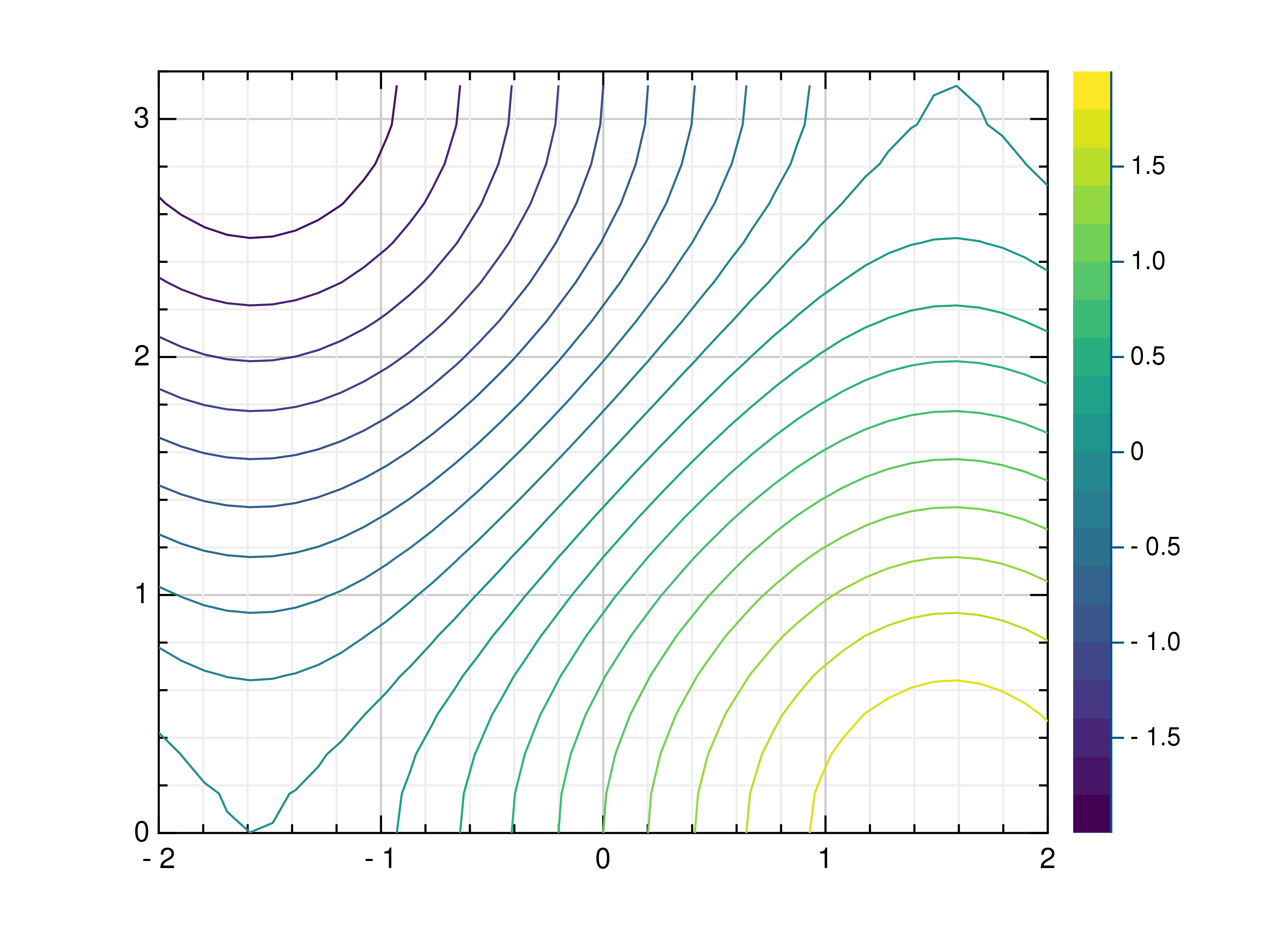
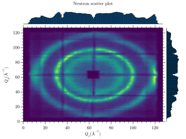
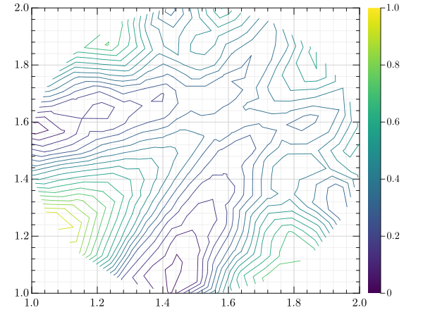
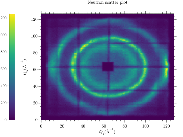
contour
A contour plot displays three-dimensional data over a rectangular grid. Contour lines representing different height
values are displayed depending on the specified number of levels. This contour plot uses the sans dataset. The
title and axis labels are defined in the data header. More information’s about the format of these files can be found
under data_file.
# title : Neutron scatter plot
# x_label : $Q_x (Å^{-1})$
# y_label : $Q_y (Å^{-1})$
To create a contour plot from the command line, set the kind parameter to contour. The additional cmap
parameter can be used to change the colormap.
grplot sans.dat kind:contour cmap:3
The following picture shows some other options, where the number of levels is 40 instead of 20. Any major_h value
greater than 1000 results in numbers appearing on the contour lines, while x_log is used to improve visibility of
the numbers.
grplot sans.dat kind:contour levels:40 major_h:1003 x_log:1 cmap:3
Following parameters can be used:
cmap, columns, consecutive_colorbars, file, grplot, ignore_blank_lines, join_plots, keep_aspect_ratio, kind, levels, major_h, only_square_aspect_ratio, title, use_bins, x_columns, x_flip, x_grid, x_label, x_lim, x_log, x_range, xyz_file, y_columns, y_flip, y_grid, y_label, y_lim, y_log, y_range, z_lim, z_log, z_range
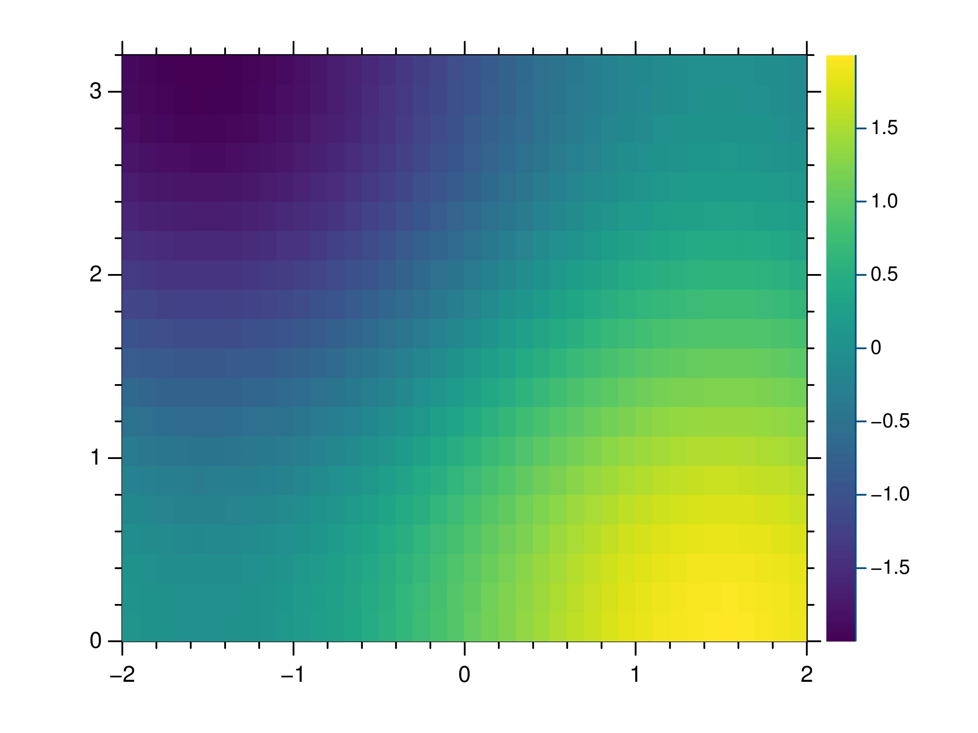
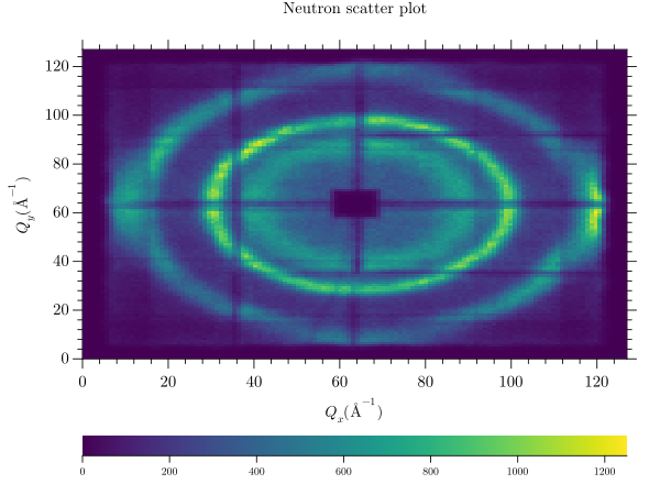
contourf
A contourf plot displays three-dimensional data over a rectangular mesh. Depending on the specified number of levels, contour lines representing different height values are displayed. The space between the contour lines is filled with a colour according to the specified colormap. This contour plot uses the sans dataset. The title and axis labels are defined in the data header. More information’s about the format of these files can be found under data_file.
# title : Neutron scatter plot
# x_label : $Q_x (Å^{-1})$
# y_label : $Q_y (Å^{-1})$
To create a filled contour plot from the command line, the kind parameter must be set to contourf.
grplot sans.dat kind:contourf
Following parameters can be used:
cmap, columns, consecutive_colorbars, file, grplot, ignore_blank_lines, join_plots, keep_aspect_ratio, kind, levels, major_h, only_square_aspect_ratio, title, use_bins, x_columns, x_flip, x_grid, x_label, x_lim, x_log, x_range, xyz_file, y_columns, y_flip, y_grid, y_label, y_lim, y_log, y_range, z_lim, z_log, z_range
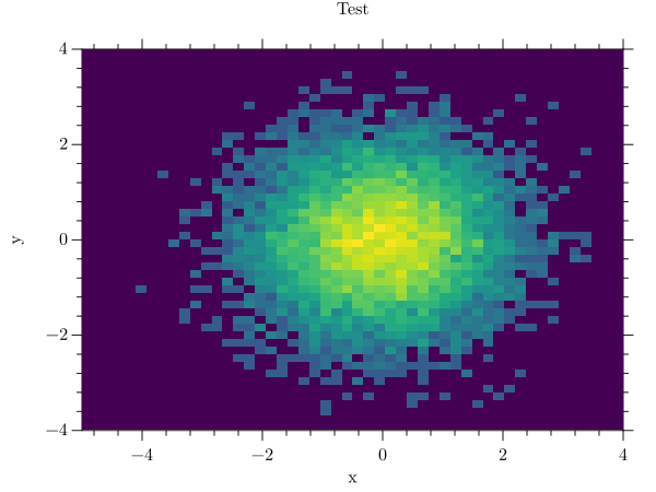
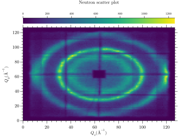
heatmap
A heatmap uses the current colour map to display data. Each data point is represented by a coloured square whose size depends on the amount of data. This heatmap plot uses the sans dataset. The title and axis labels are defined in the data header. More information’s about the format of these files can be found under data_file.
# title : Neutron scatter plot
# x_label : $Q_x (Å^{-1})$
# y_label : $Q_y (Å^{-1})$
To create a heatmap plot from the command line, the kind parameter must be set to heatmap. Both axes use a
logarithmic scale.
grplot sans.dat kind:heatmap x_log:1 y_log:1
Following parameters can be used:
cmap, columns, consecutive_colorbars, file, grplot, ignore_blank_lines, join_plots, keep_aspect_ratio, kind, only_square_aspect_ratio, resample_method, title, use_bins, x_columns, x_flip, x_grid, x_label, x_lim, x_log, x_range, xyz_file, y_columns, y_flip, y_grid, y_label, y_lim, y_log, y_range, z_lim, z_log, z_range
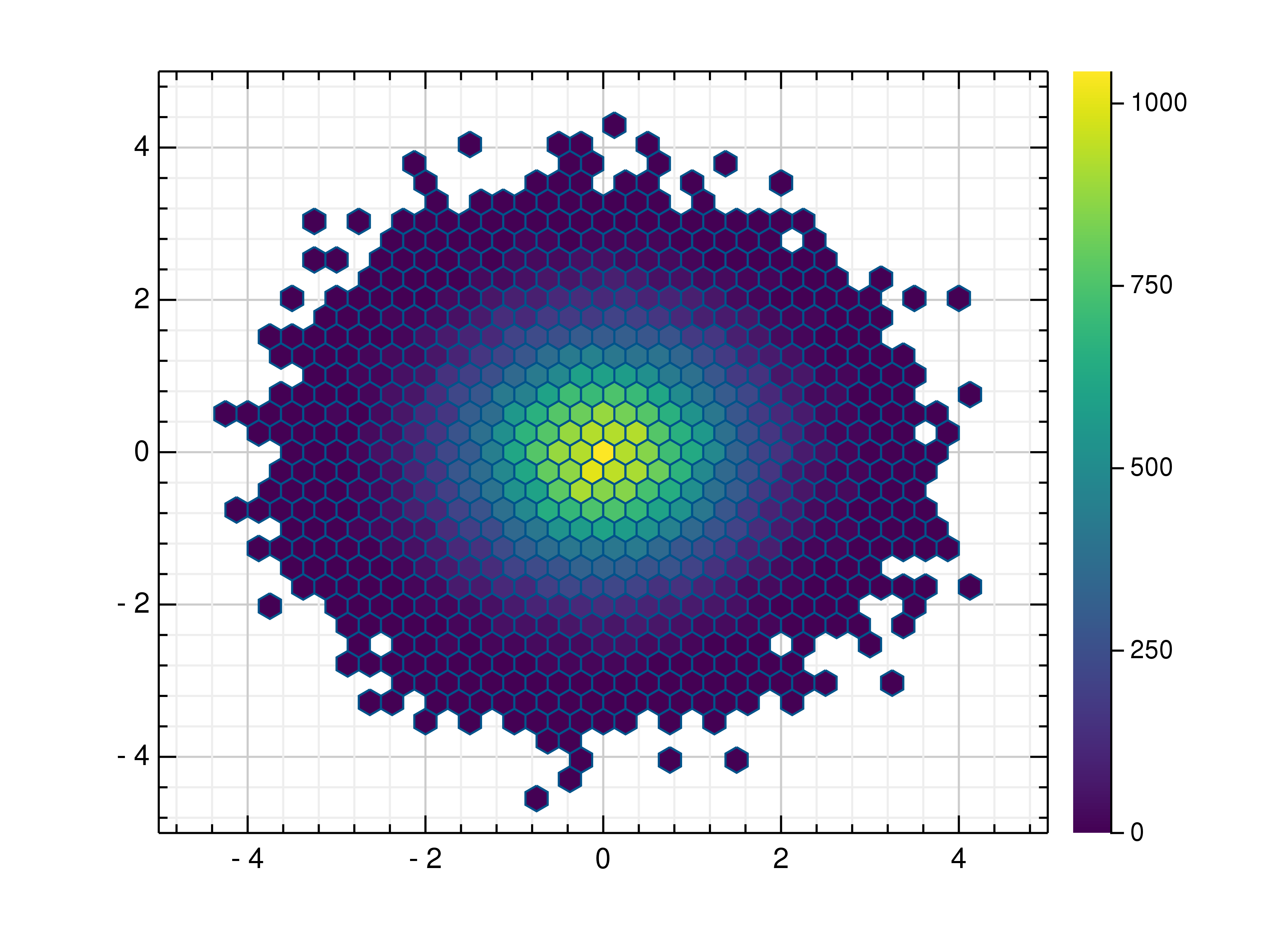
hexbin
A hexbin uses hexagonal binning and the current colour map to display the data. Such a plot can be easily created from the command line using the following command:
grplot hexbin.dat kind:hexin
This example uses the hexbin data file. It contains additional key-value pairs in the data header. More information’s about the format of these files can be found under data_file.
# title : Test
# x_label : x
# y_label : y
Following parameters can be used:
cmap, columns, consecutive_colorbars, file, grplot, ignore_blank_lines, join_plots, keep_aspect_ratio, kind, num_bins, only_square_aspect_ratio, title, x_columns, x_flip, x_grid, x_label, x_lim, x_range, y_columns, y_flip, y_grid, y_label, y_lim, y_range
histogram
A histogram provides an approximate representation of the distribution of numerical data. It should have two columns
containing the x- and y-data. To create a histogram from the command line, use kind histogram. The num_bins
parameter defines how many bins are displayed. The data file histogram is used. More information’s about the format of
these files can be found under data_file.
grplot histogram.dat kind:histogram num_bins:20
In the right plot, these parameters are extended to include a vertical orientation with orientation:vertical, as
well as ranges for the x- and y-data.
# x_range : 2,3
# y_range : 5, 8
Following parameters can be used:
bar_color, bottom, columns, edge_color, error, error_bar_style, error_columns, error_type, equal_up_and_down_error, file, grplot, ignore_blank_lines, join_plots, keep_aspect_ratio, kind, left, num_bins, orientation, right, title, top, twin_x, twin_y, x_grid, x_label, x_lim, x_log, x_range, xye_file, y_columns, y_flip, y_grid, y_label, y_lim, y_log
imshow
An imshow plot displays data as a coloured image, with each data point represented by a coloured rectangle within the
image. To create an imshow plot from the command line, kind must be set to imshow. The data file in this example
is sans. More information’s about the format of these files can be found under data_file.
grplot sans.dat kind:imshow
Following parameters can be used:
cmap, columns, file, grplot, ignore_blank_lines, keep_aspect_ratio, kind, only_square_aspect_ratio, title, x_columns, x_flip, xyz_file, y_columns, y_flip, z_lim
isosurface
An isosurface is a three-dimensional analogue of a contour- or isoline. To create an isosurface from the command line,
the kind parameter must be set to isosurface. In this example, the data file is called volume. More
information’s about the format of these files can be found under data_file.
grplot volume.dat kind:isosurface

Following parameters can be used:
columns, file, grplot, ignore_blank_lines, isovalue, join_plots, kind, rotation, tilt, title, x_columns, x_flip, x_lim, x_log, x_range, xyz_file, y_columns, y_flip, y_lim, y_log, y_range, z_grid, z_lim, z_log, z_range
line
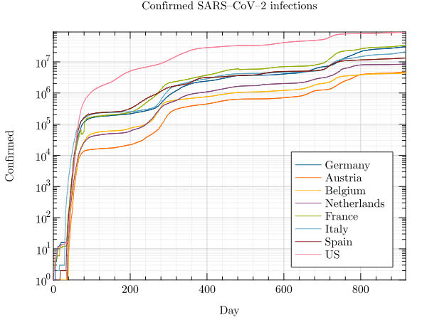
A line plot is a simple graph in which data points are joined together by a line. To create a line plot from the command
line, the kind parameter must be set to line. As a data file covid19 is used. More information’s about the
format of these files can be found under data_file.
grplot covid19.csv kind:line
The following example includes parameters defined in the data header, such as the title and axis labels. The parameter
location defines where the legend is placed, while x_lim sets the minimum and maximum limits of the x-axis.
# title : Confirmed SARS–CoV–2 infections
# x_label : Day
# y_label : Confirmed
# x_lim : 0.0, 917 + 1.0
# y_log : 1
# location : 4
The right-hand plot uses command-line arguments and the target_mtl data file.
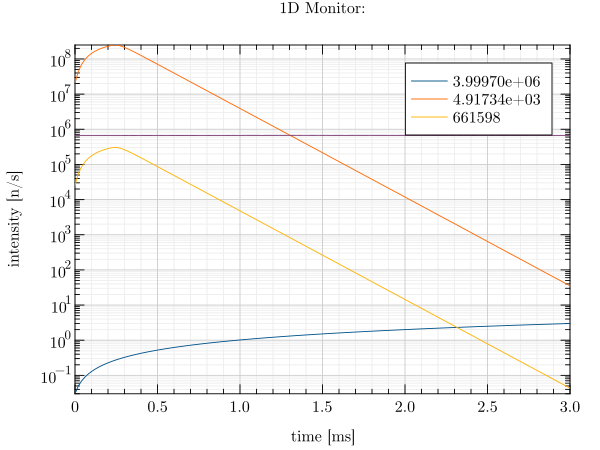
grplot target_mtl.1D kind:line y_log:1
A line plot can be combined with a scatter plot to mark data points. The line_spec parameter can be used for this.
In this case, the data file is stem. More information’s about the format of these files can be found under data_file.
grplot stem.dat kind:line line_spec:+-
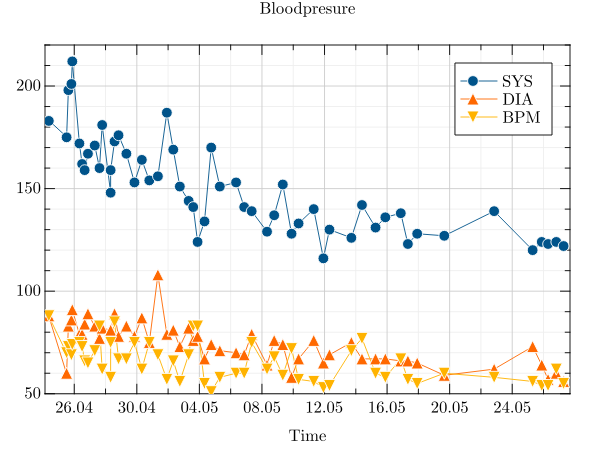
Another common use of a line plot is to display time data. For these GRPlot applies some defaults such as
keep_aspect_ratio:0, line_spec:+- and sets every time columns as x_columns while the rest are set as
y_columns. In this special case, parameters such as x_range and x_lim also require time-based entries.
Furthermore, it is not possible to include non-time-based x-values within the data. The following example uses the
blood_pressure file.
grplot blood_pressure.csv
Following parameters can be used:
bottom, columns, error, error_bar_style, error_columns, error_type, equal_up_and_down_error, file, grplot, ignore_blank_lines, int_limits_high, int_limits_low, join_plots, keep_aspect_ratio, kind, left, legend, legend_line, line_spec, location, marker_size, marker_type, orientation, right, title, top, twin_x, twin_y, x_columns, x_flip, x_grid, x_label, x_lim, x_log, x_range, xye_file, y_columns, y_flip, y_grid, y_label, y_lim, y_log, y_range
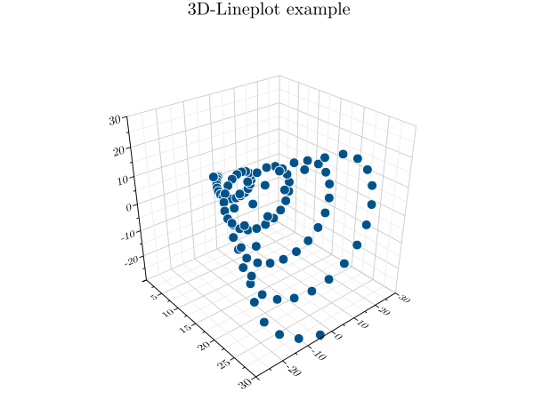
line3
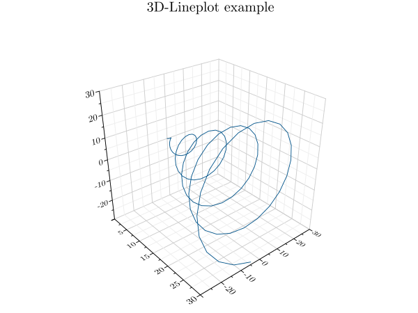
A line3 plot is a simple three-dimensional graph in which data points are joined together by a line. To create a
three-dimensional line plot from the command line, the kind parameter must be set to line3. For this example,
the data file is called plot3. More information’s about the format of these files can be found under data_file.
grplot plot3.dat kind:line3
Following parameters can be used:
columns, file, grplot, hkind, ignore_blank_lines, join_plots, kind, legend, legend_line, location, title, x_columns, x_flip, x_grid, x_label, x_lim, x_log, x_range, xyz_file, y_columns, y_flip, y_grid, y_label, y_lim, y_log, y_range, z_grid, z_label, z_lim, z_log, z_range
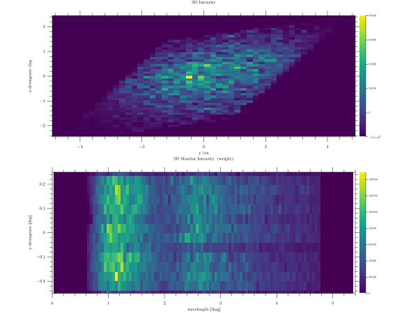
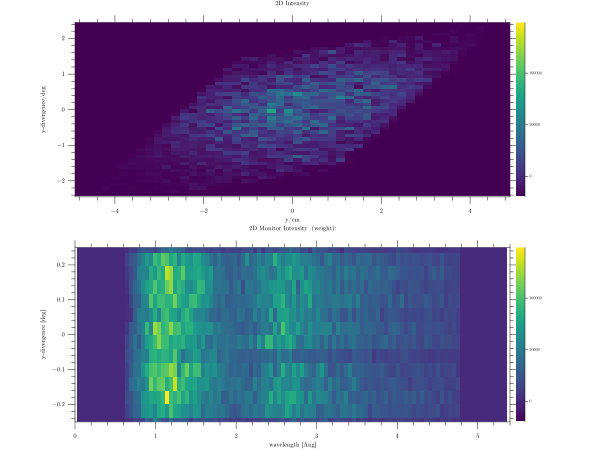
marginal_heatmap
A marginal heatmap combines a heatmap with either stair plots or histograms. These additional plots display some of the
heatmap data in the vertical and horizontal directions at the margins of the heatmap. To create a marginal heatmap from
the command line, use kind marginal_heatmap. A marginal heatmap is a special type of heatmap where the sum or
maximum of each line and column is displayed on the side. The data file is sans. More information’s about the format of
these files can be found under data_file.
grplot sans.dat kind:marginal_heatmap
When h_kind is set to line``(right), the values of the row and column at the position of the mouse pointer are
displayed. ``use_bins specifies that the first row and column in the data file are interpreted as x- and y-ranges. The
data file for this example is sample_y_divy.
grplot sample_y_divy.dat kind:marginal_heatmap use_bins:1 h_kind:line
Following parameters can be used:
algorithm, cmap, columns, file, grplot, hkind, ignore_blank_lines, join_plots, keep_aspect_ratio, kind, only_square_aspect_ratio, resample_method, title, use_bins, x_columns, x_flip, x_grid, x_label, x_lim, x_log, x_range, xyz_file, y_columns, y_flip, y_grid, y_label, y_lim, y_log, y_range, z_lim, z_log, z_range
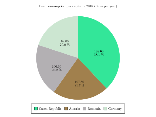
pie
A pie chart is a circular statistical plot that displays one series of data. The total area of the chart represents the
total percentage of the given data. The size of each slice represents the percentage of the data it comprises. To create
a pie chart from the command line, the kind parameter must be set to pie. The data file is called pie. More
information’s about the format of these files can be found under data_file.
grplot pie.dat kind:pie
Following parameters can be used:
columns, file, grplot, ignore_blank_lines, kind, legend, legend_line, title
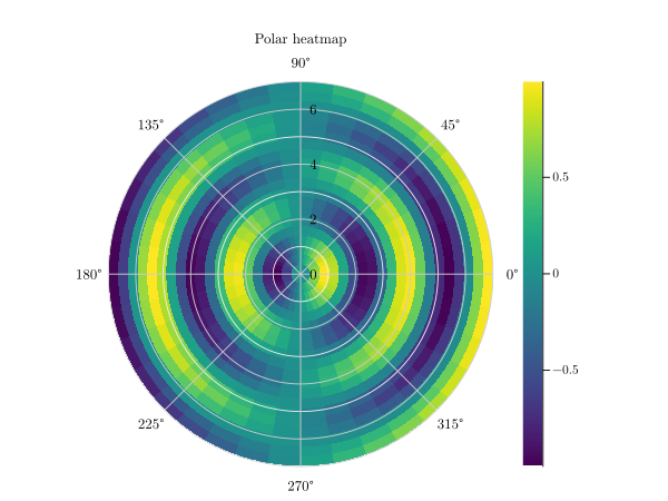
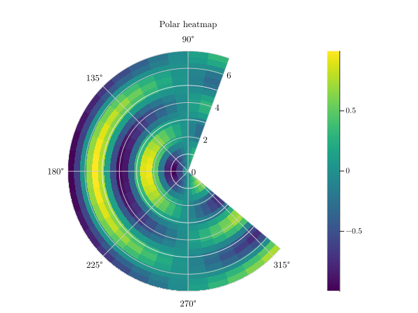
polar_heatmap
A polar heatmap uses polar coordinates rather than Cartesian coordinates. To create a polar heatmap plot from the
command line, the kind parameter must be set to polar_heatmap. This example uses the polarheatmap data file.
More information’s about the format of these files can be found under data_file.
grplot polarheatmap.dat kind:polar_heatmap
With an additional theta_lim:70,320 only a part of the polar heatmap will be displayed.
Following parameters can be used:
cmap, columns, consecutive_colorbars, file, grplot, ignore_blank_lines, join_plots, kind, r_flip, r_lim, r_log, theta_flip, theta_data_lim, theta_lim, title, x_columns, x_label, y_columns, y_label
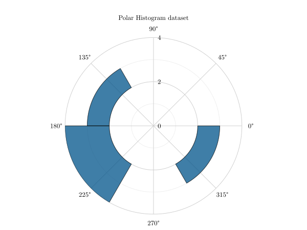
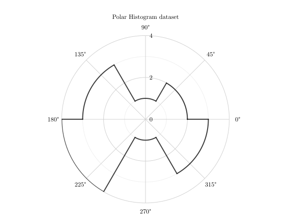
polar_histogram
A polar histogram is a histogram that uses polar coordinates. To create a polar histogram plot from the command line,
set the kind parameter to polar_histogram. The corresponding data file is polar_histogram. More information’s
about the format of these files can be found under data_file.
grplot polar_histogram.dat kind:polar_histogram
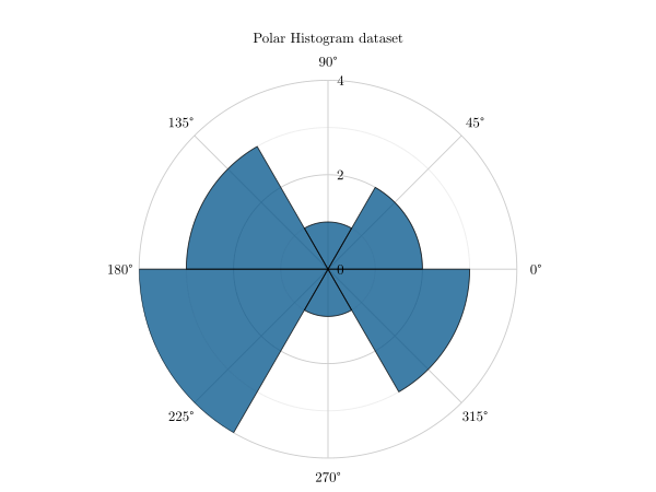
Additional parameters offer more possibilities such as
r_lim:2,8 keep_radii_axes:1
or
stairs:1
Following parameters can be used:
bin_counts, bin_edges, bin_width, columns, draw_edges, edge_color, file, grplot, ignore_blank_lines, join_plots, keep_radii_axes, kind, num_bins, normalization, r_flip, r_lim, r_log, stairs, theta_flip, theta_data_lim, theta_lim, title, x_columns, x_label, y_columns, y_label
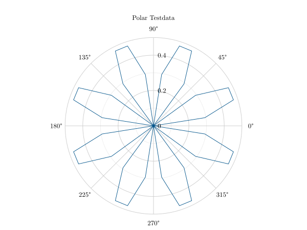
polar_line
A polar plot displays a polyline in polar coordinates. The angle in radians is indicated by theta(x), and the radius
value for each point is indicated by r(y). To create a polar line plot from the command line, the kind parameter
must be set to polar_line. This example uses the polar data file. More information’s about the format of these
files can be found under data_file.
grplot polar.dat kind:polar_line
Following parameters can be used:
clip_negative, columns, file, grplot, ignore_blank_lines, join_plots, kind, legend, legend_line, line_spec, location, marker_size, marker_type, r_flip, r_lim, r_log, theta_flip, theta_data_lim, theta_lim, title, x_columns, x_label, y_columns, y_label
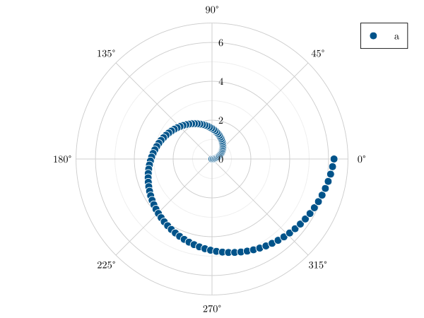
polar_scatter
In a polar scatter plot, each data point is displayed as a point within a polar coordinate system. Theta(x) indicates
the angle in radians and r(y) indicates the radius for each point. To create a polar scatter plot from the command line,
the kind parameter must be set to polar_scatter. In this example, the polar_thetatheta data file is used. More
information’s about the format of these files can be found under data_file.
grplot polar_thetatheta.dat kind:polar_scatter
Following parameters can be used:
clip_negative, columns, file, grplot, ignore_blank_lines, join_plots, kind, legend, legend_line, line_spec, location, marker_size, marker_type, r_flip, r_lim, r_log, theta_flip, theta_data_lim, theta_lim, title, x_columns, x_label, y_columns, y_label
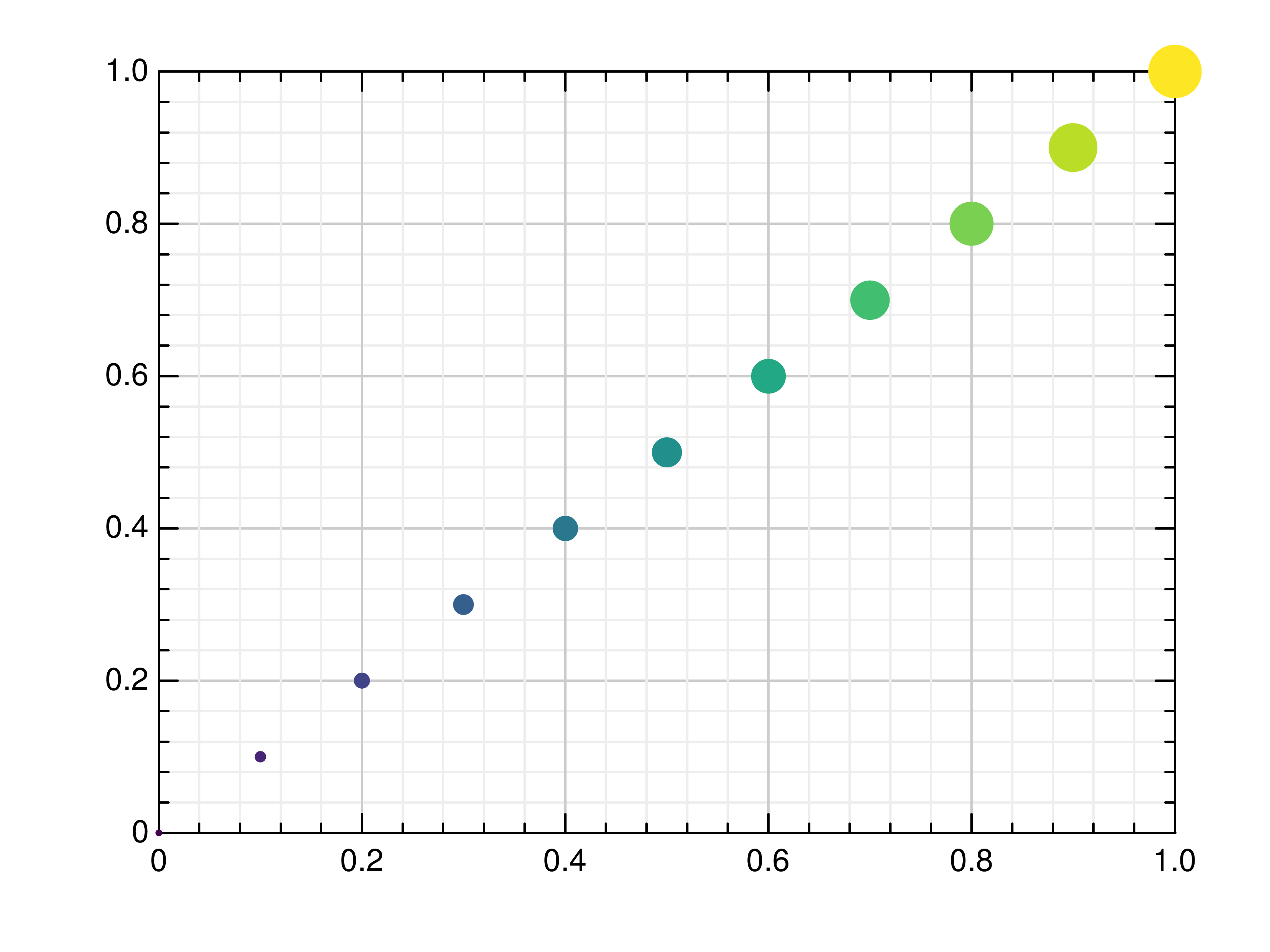
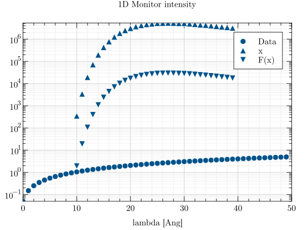
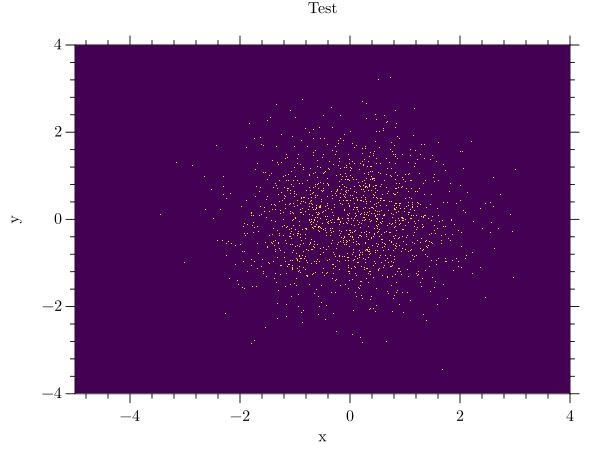
scatter
In a scatter plot, each data point is displayed as an individual point within a two-dimensional coordinate system. A
scatter plot can be created from the command line using the scatter option. The marker type can also be changed, as
shown in the picture on the left, where it is set to square. The c parameter in the data file defines the color
values applied to each marker. The data file is called scatter. More information’s about the format of these files can
be found under data_file.
grplot scatter.dat kind:scatter marker_type:-7
If there are multiple series, each scatter plot gets its own marker. The columns parameter defines which columns of
the target_mtl data file should be used.
grplot target_mtl.1D kind:scatter y_log:1 columns:1,2,3
Following parameters can be used:
bottom, columns, file, grplot, ignore_blank_lines, join_plots, keep_aspect_ratio, kind, left, legend, legend_line, line_spec, location, marker_size, marker_type, orientation, right, title, top, twin_x, twin_y, x_columns, x_flip, x_grid, x_label, x_lim, x_log, x_range, xye_file, y_columns, y_flip, y_grid, y_label, y_lim, y_log, y_range
scatter3
A three-dimensional scatter plot shows each data point as an individual point within a three-dimensional coordinate
system. To create a 3d scatter plot from the command line, set the kind parameter to scatter3. This example uses the
plot3 data file. More information’s about the format of these files can be found under data_file.
grplot plot3.dat kind:scatter3
A colored 3d scatter plot can be created by defining additional color values (c) in the data file.
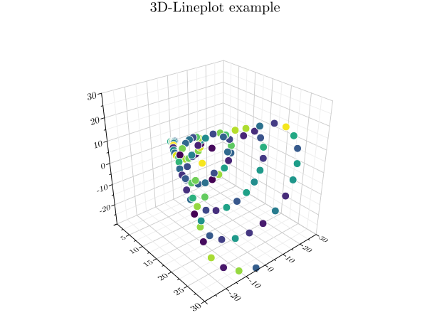
Following parameters can be used:
columns, file, grplot, ignore_blank_lines, join_plots, kind, legend, legend_line, location, title, x_columns, x_flip, x_grid, x_label, x_lim, x_log, x_range, xyz_file, y_columns, y_flip, y_grid, y_label, y_lim, y_log, y_range, z_grid, z_label, z_lim, z_log, z_range
shade
A shade plot can be used to create a heatmap from point- or line-based data. To create a shade plot using GRPlot, set
the plot type to shade. The data file hexbin is used for these examples. More information’s about the format of
these files can be found under data_file.
grplot hexbin.dat kind:shade
The additional x- and y-bins parameters define the number of bins in each direction, while a cubic transformation is also used for the right-hand image. Combining these additional parameters helps to produce a more meaningful result.
grplot hexbin.dat kind:shade x_bins:50 y_bins:50 transformation:4
Following parameters can be used:
cmap, columns, file, grplot, ignore_blank_lines, join_plots, keep_aspect_ratio, kind, only_square_aspect_ratio, transformation, x_bins, x_flip, x_grid, x_label, x_lim, x_log, x_range, y_bins, y_flip, y_grid, y_label, y_lim, y_log, y_range, z_lim, z_log, z_range
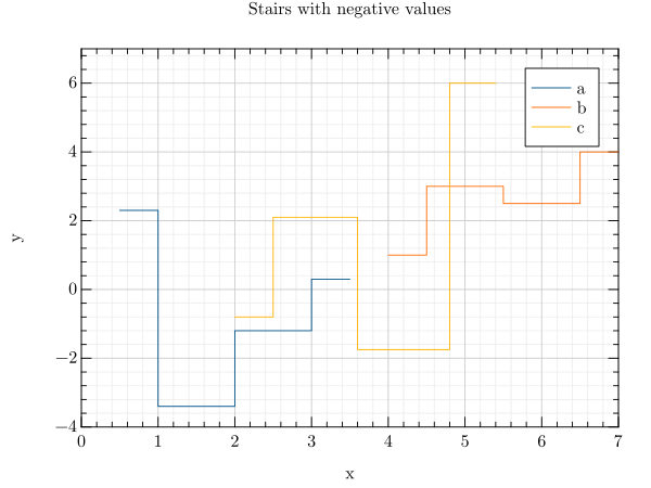
stairs
A stair plot is a piecewise constant function with a finite number of pieces. To create a stair plot from the command
line, use the stairs option. The data file is set to stem. More information’s about the format of these files can
be found under data_file.
grplot stem.dat kind:stairs
Following parameters can be used:
bottom, columns, file, grplot, ignore_blank_lines, join_plots, keep_aspect_ratio, kind, left, legend, legend_line, line_spec, location, marker_type, orientation, right, step_where, title, top, twin_x, twin_y, x_columns, x_flip, x_grid, x_label, x_lim, x_log, x_range, y_columns, y_flip, y_grid, y_label, y_lim, y_log, y_range
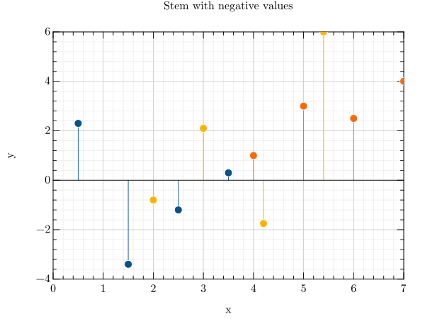
stem
In a stem plot, lines are drawn perpendicular to the baseline at each point between the baseline and the data values. To
create a stem plot from the command line, use kind stem. The x- and y-columns define which columns of the data
are to be interpreted as x and y respectively. This example uses the stem data file. More information’s about the
format of these files can be found under data_file.
grplot stem.dat kind:stem x_columns:1,4,6 y_columns:2,5,7
Following parameters can be used:
bottom, columns, file, grplot, ignore_blank_lines, join_plots, keep_aspect_ratio, kind, left, legend, legend_line, location, marker_type, orientation, right, title, top, twin_x, twin_y, x_columns, x_flip, x_grid, x_label, x_lim, x_log, x_range, y_columns, y_flip, y_grid, y_label, y_lim, y_log, y_range
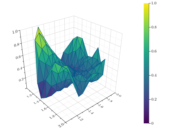
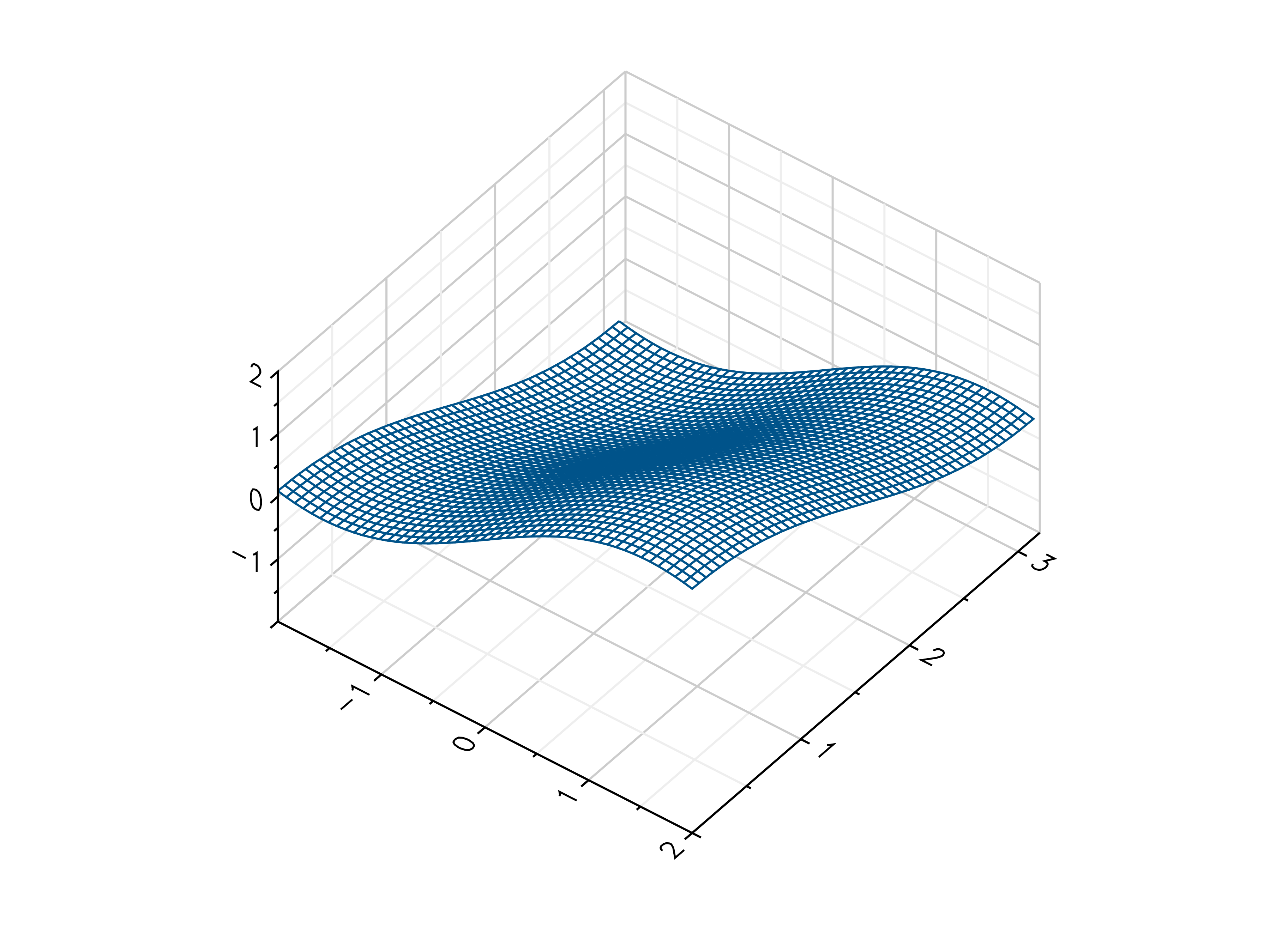
surface
A surface plot can be compared with a visualisation of a two-variable function in three-dimensional space. To create a
surface plot from the command line, the kind parameter must be set to surface. This example uses the sans data
file. More information’s about the format of these files can be found under data_file.
grplot sans.dat kind:surface
Following parameters can be used:
accelerate, cmap, columns, consecutive_colorbars, file, grplot, ignore_blank_lines, join_plots, kind, use_bins, x_columns, x_flip, x_grid, x_label, x_lim, x_log, x_range, xyz_file, y_columns, y_flip, y_grid, y_label, y_lim, y_log, y_range, z_grid, z_label, z_lim, z_log, z_range
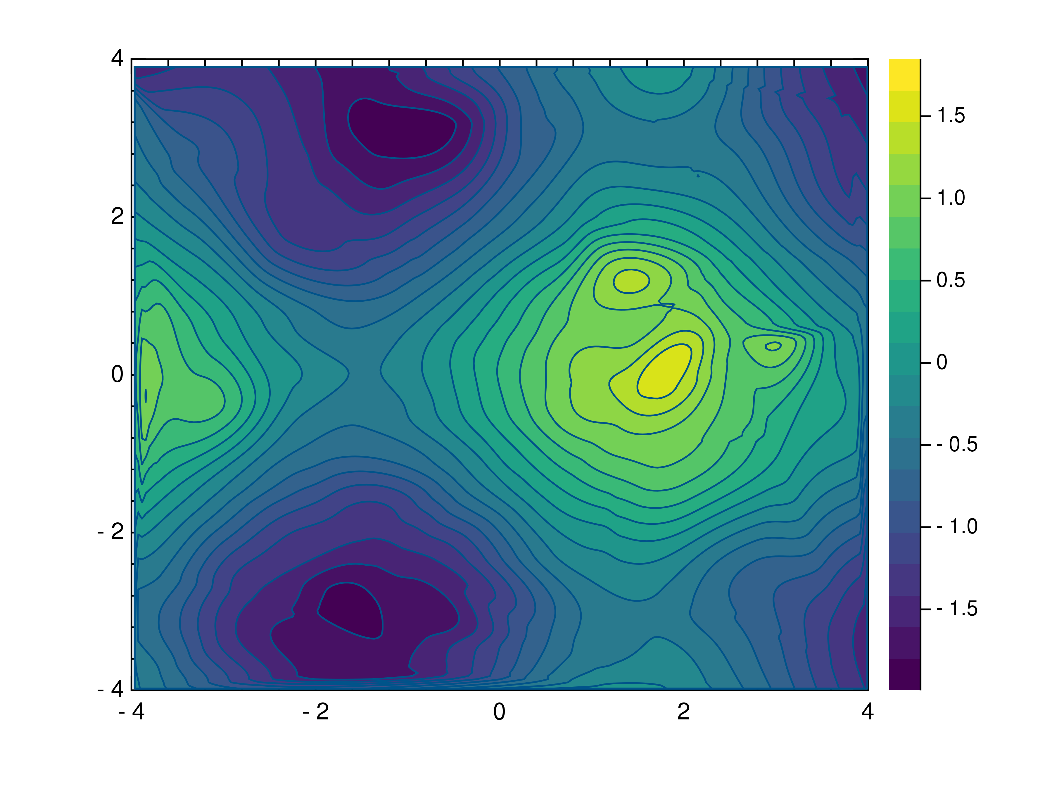
tricontour
A tricontour plot shows contour lines on an unstructured triangular grid. To create a tricontour plot from the command
line, set the kind parameter to tricontour. In this case, the data file is also named tricontour. More
information’s about the format of these files can be found under data_file.
grplot tricontour.dat kind:tricontour
Following parameters can be used:
cmap, columns, consecutive_colorbars, file, grplot, ignore_blank_lines, join_plots, keep_aspect_ratio, kind, levels, x_columns, x_flip, x_grid, x_label, x_lim, x_log, x_range, xyz_file, y_columns, y_flip, y_grid, y_label, y_lim, y_log, y_range, z_lim, z_log, z_range
trisurface
A trisurface is a type of surface plot created by triangulating compact surfaces consisting of a finite number of
triangles that cover the entire surface, ensuring that each point on the surface lies within a triangle. To create a
trisurface plot from the command line, the kind parameter must be set to trisurface. This example uses the
tricontour data file again. More information’s about the format of these files can be found under data_file.
grplot tricontour.dat kind:trisurface
Following parameters can be used:
cmap, columns, consecutive_colorbars, file, grplot, ignore_blank_lines, join_plots, kind, x_columns, x_flip, x_grid, x_label, x_lim, x_log, x_range, xyz_file, y_columns, y_flip, y_grid, y_label, y_lim, y_log, y_range, z_grid, z_label, z_lim, z_log, z_range
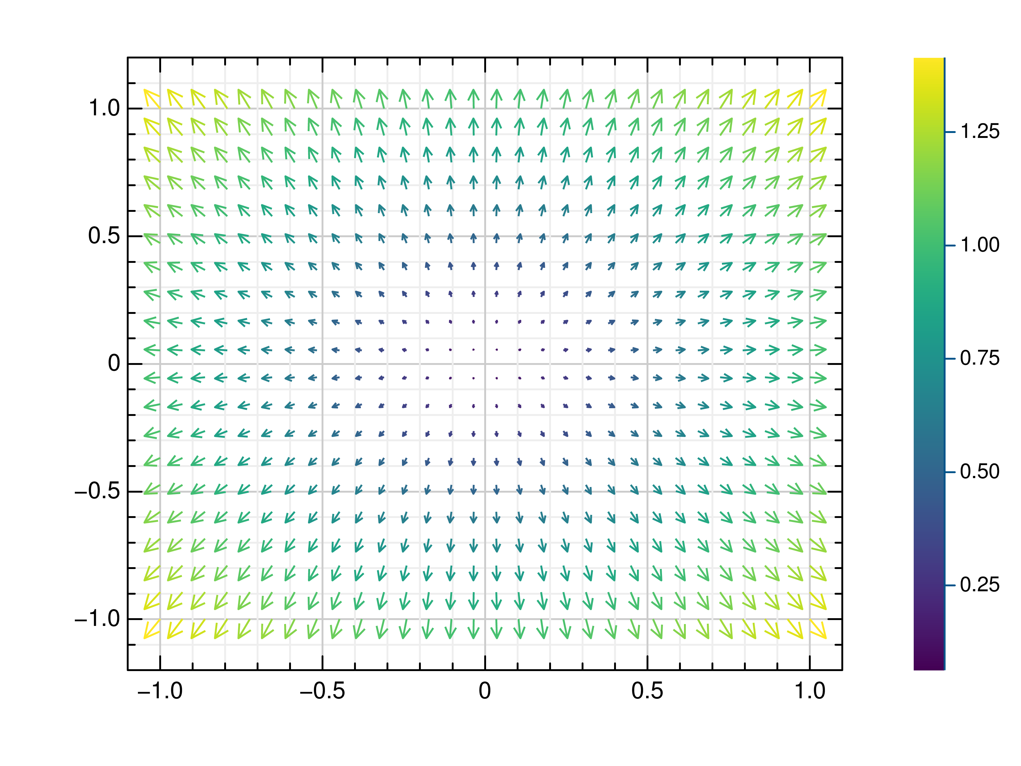
quiver
A quiver plot is a type of two-dimensional plot that displays vectors as arrows. To create a quiver plot from the
command line, the kind parameter must be set to quiver. In this example, the quiver data file is used. More
information’s about the format of these files can be found under data_file.
grplot quiver.dat kind:quiver
Following parameters can be used:
cmap, columns, consecutive_colorbars, file, grplot, hkind, ignore_blank_lines, join_plots, keep_aspect_ratio, kind, title, x_flip, x_grid, x_label, x_lim, x_log, x_range, y_flip, y_grid, y_label, y_lim, y_log, y_range, z_lim
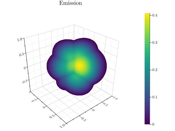
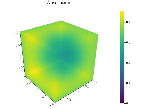
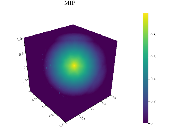
volume
A volume plot uses volume rendering to draw a three-dimensional data set. The volume data is first reduced to a
two-dimensional image using either an emission or an absorption model, or via a maximum intensity projection. The
current colormap is then applied to the result. To create a volume plot from the command line, the kind parameter
must be set to volume. The algorithm determines how the rays are calculated. This example uses the volume data
file. More information’s about the format of these files can be found under data_file.
grplot volume.dat kind:volume algorithm:emission
Following parameters can be used:
algorithm, cmap, columns, consecutive_colorbars, file, grplot, ignore_blank_lines, join_plots, kind, title, x_columns, x_flip, x_grid, x_label, x_lim, x_log, x_range, y_columns, y_flip, y_grid, y_label, y_lim, y_log, y_range, z_grid, z_label, z_lim, z_log, z_range
wireframe
In a wireframe plot, a grid of values is projected onto a specified three-dimensional surface. This surface has a grid
structure itself. To create a wireframe plot from the command line, the kind parameter must be set to wireframe.
The use_bins parameter then defines the x- and y-ranges as being defined in the first row and column. The
sample_y_divy data file is used here. More information’s about the format of these files can be found under data_file.
grplot sample_y_divy.dat kind:wireframe use_bins:1
Following parameters can be used:
columns, file, grplot, ignore_blank_lines, join_plots, kind, use_bins, x_columns, x_flip, x_grid, x_label, x_lim, x_log, x_range, xyz_file, y_columns, y_flip, y_grid, y_label, y_lim, y_log, y_range, z_grid, z_label, z_lim, z_log, z_range
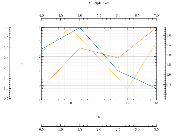
Multiple axes
To create a plot with additional axes, the bottom, top, left, right, twin_x and twin_y
parameters must be used. The number behind each of these parameters defines which series is displayed on that axis. This
example uses the multi_axes data file.
multi_axes.dat x_columns:1,4,6 y_columns:2,5,7 twin_x:0 twin_y:1 kind:line
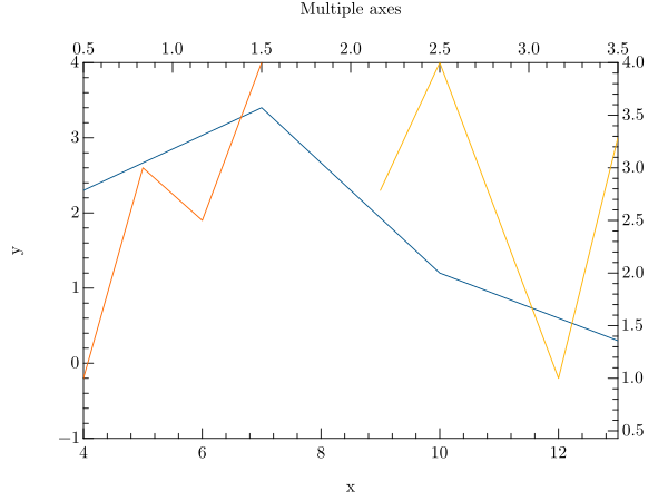
Another example that uses twin axes is:
multi_axes.dat x_columns:1,4,6 y_columns:2,5,7 right:0 left:1 bottom:0 top:1 kind:line
Following parameters can be useful for it:
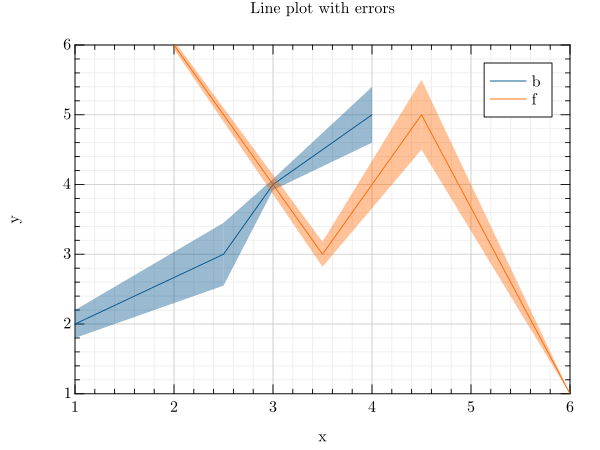
Error bars
There are multiple ways to display error data. For example, you can use xye_file, equal_up_and_down_error,
error or name the error columns. You can also change the color of the error bars with the example file line_error.
grplot line_error.dat kind:line error:{error_bar_color:3} x_columns:1,5 y_columns:2,6 error_columns:3,4,7,8
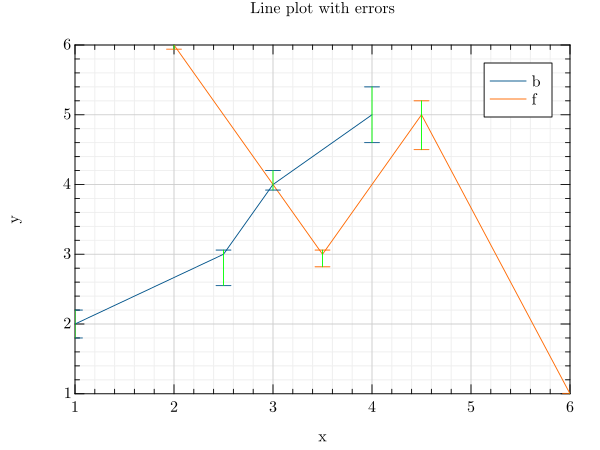
The style of the error bars can be changed too.
grplot line_error.dat kind:line x_columns:1,5 y_columns:2,6 error_columns:3,7 error_bar_style:1 equal_up_and_down_error:1
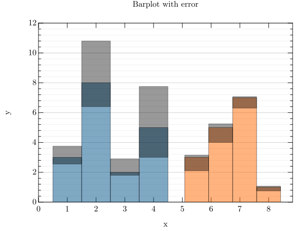
In the case of a bar plot, the key value pair error bar style:1 is represented differently, while the y_lim
parameter defines the limits of the y-axis. The data file is called barplot_error.
grplot barplot_error.dat kind:barplot bar_width:1 error_bar_style:1 x_columns:1,3 y_columns:2,4 error_columns:5,6,7,8 error:{} y_lim:0,12
Following parameters can be useful for it:
error, error_bar_style, error_columns, error_type, equal_up_and_down_error, xye_file
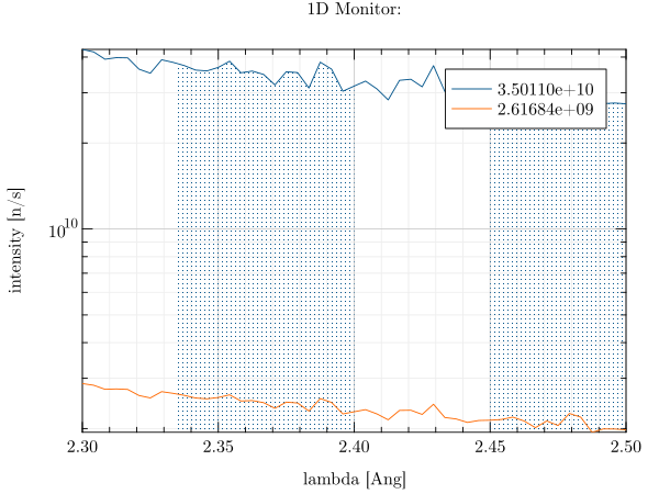
Integral
An integral can be created for line plots using the int_limits_high and int_limits_low parameters. In the
following example, the data columns are restricted and the y-axis is displayed in a logarithmic scale. The data file is
lambda.
grplot lambda.dat kind:line int_limits_high:2,2.4,2.5 int_limits_low:2,2.335,2.45 columns:2,3 y_log:1
Following parameters can be useful for it:
Multiplot
To create multiple plots, it is necessary to use the --plot key in front of the file and key-value pairs.
grplot \
  --plot ./lib/grm/grplot/data/sans.dat kind:heatmap \
  --plot ./lib/grm/grplot/data/polar.dat kind:polar_line \
  --plot ./lib/grm/grplot/data/pie.dat kind:pie \
  --plot ./lib/grm/grplot/data/sans.dat kind:wireframe \
  --plot ./lib/grm/grplot/data/barplot.dat kind:barplot style:stacked \
  --plot ./lib/grm/grplot/data/quiver.dat kind:quiver
grplot \
  --plot ./lib/grm/grplot/data/sans.dat kind:contour levels:40 \
  --plot ./lib/grm/grplot/data/polar_histogram.dat kind:polar_histogram \
  --plot ./lib/grm/grplot/data/source_time.dat kind:line y_log:1 \
  --plot ./lib/grm/grplot/data/volume.dat kind:volume
The editor must be used to apply larger changes, such as adding multiple columns or rows to a single plot.
Mixed plots
Similar to the multi plots, a mixed plot of different series can be created. To do this, the --plot key must be used
again, with each plot defining its series. The next step is to use the join_plots parameter to merge the defined
plots and create a plot with mixed series. Since the line_spec parameter only works on 2d plots, we can create a
scatter and line plot combination this way that looks like a line_spec result.`
grplot \
  --plot ./lib/grm/grplot/data/plot3.dat kind:scatter3 \
  --plot ./lib/grm/grplot/data/plot3.dat kind:line3 join_plots:1,2

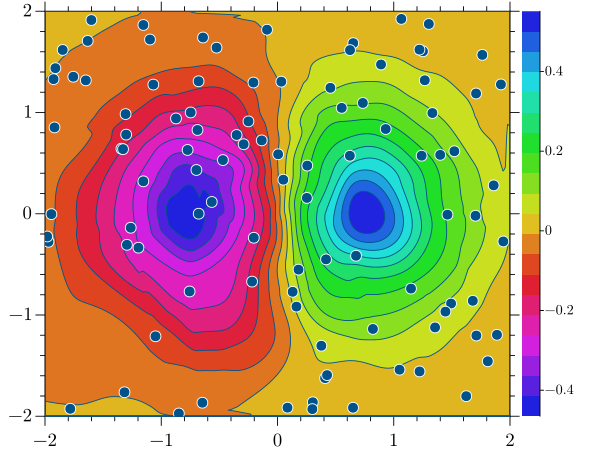
Another example, which uses a combination of a scatter and a contour plot, can be created with this command line inside GRPlot. This example is also used in other places in this documentation. This one uses the mixed_series and mixed_series_contour dataset.
grplot \
  --plot ./lib/grm/grplot/data/mixed_series_contour.dat kind:contourf x_range:-2,2 y_range:-2,2 colormap:48 \
  --plot ./lib/grm/grplot/data/mixed_series.dat kind:scatter x_columns:1 y_columns:2 columns:1,2  join_plots:1,2
Following parameters can be useful for it:
Colorbar
There are three main ways to modify the colorbar inside GRPlot. One option is to change the colormap, while another is to adjust the location of the colorbar, which can be quickly changed between four locations.
The third option is to adjust the limits that the colour bar displays. In a multiplot, all colorbars can easily be
modified to have the same limits. To do this, the consecutive_colorbars parameter can be used.
This last example was created using a trick that alters the z-value ranges, giving the consecutive_colorbars
parameter more visual impact.
grplot \
  --plot ./lib/grm/grplot/data/sample_y_divy.dat kind:heatmap use_bins:1 z_range:-20000,80000 \
  --plot ./lib/grm/grplot/data/sample.dat kind:heatmap use_bins:1 y_lim:-0.25,0.25
Following parameters can be useful for it: