Julia + GR and its Alternatives
If you are looking for a scientific visualization package, this blog post might help to make the decision easier.
To provide a basis for decision-making and start a comparison, I wrote a relatively simple application in the Julia programming language. A data set - here COVID-19 data from John Hopkins University - is to be downloaded from the Internet, analyzed, and graphically displayed.
The call is simple:
jupyter notebook covid19.ipynb

In this case, Jupyter was used as the graphical user interface. The interactive graphic is realized with the help of the JavaScript component in GR. This allows panning and zooming, the selection of a region-of-interest (ROI) as well as displaying information when hovering over the data points.
The display is in HiDPI resolution and is very performant.
The example can of course be further simplified by using the DataFrame package - but due to the small amount of data, this does not shorten the runtime.
using CSV, DataFrames
...
df = CSV.File("covid19.csv") |> DataFrame
...
filter!(row -> row[2] ∈ countries, df)
select!(df, Not([Symbol("Province/State"), :Lat, :Long]))
cummulated = aggregate(df, "Country/Region", sum)
...
confirmed = convert(Array, cummulated[2:end])
...
Alternatively, Pluto can of course be used for the graphical user interface which then leads to a reactive notebook:
julia> import Pluto; Pluto.run()
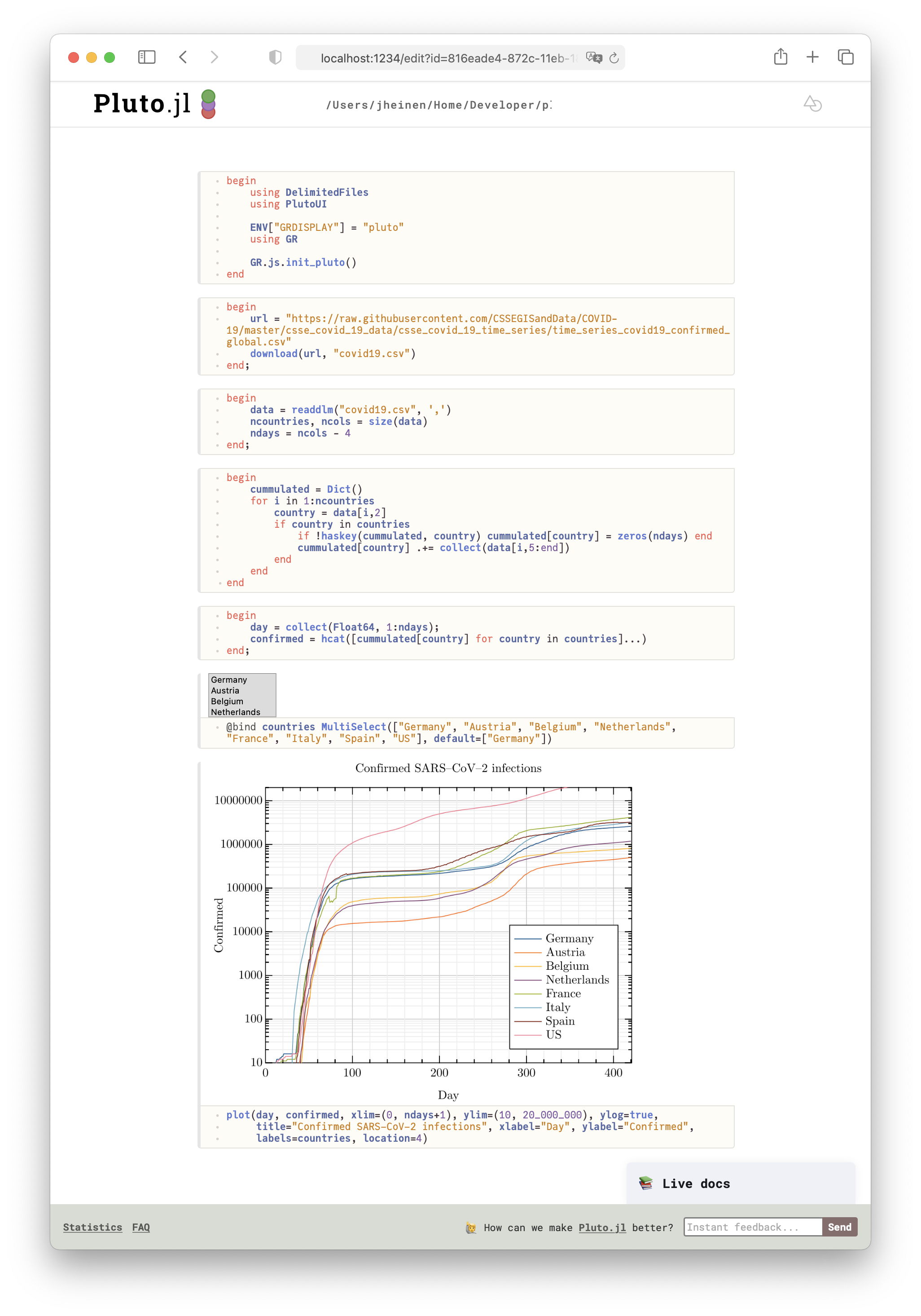
The advantage with Pluto is the simple integration of interactive control elements - in our example a MultiSelect box - for choosing different countries to be plotted. Together with small blocks of Julia code the Pluto solution forms a reactive notebook which responds instantaneously to user events.
See Pluto and GR in action here.
Alternatives
There are numerous alternatives for the above Julia application.
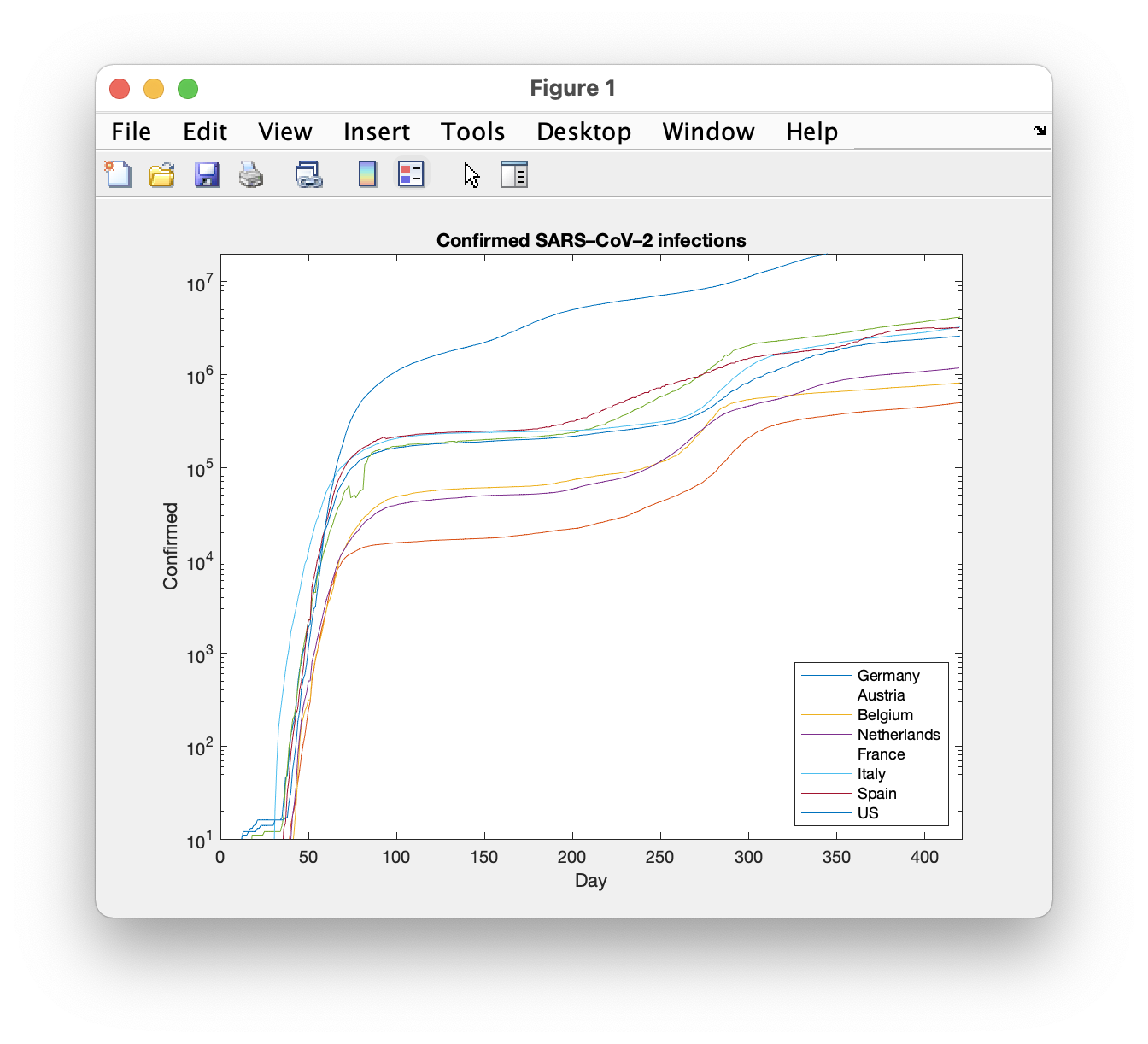
MATLAB
Let me start with a commercial variant, especially since Julia is very close to MATLAB.

The plot appears in a separate window and is also of very good quality.
Python
Of course, the same can be realized in Python. The data management can be solved with Pandas, the display is done with Matplotlib.
import pandas as pd
import matplotlib.pyplot as plt

url = "https://raw.githubusercontent.com/CSSEGISandData/COVID-19/master/csse_covid_19_data/csse_covid_19_time_series/time_series_covid19_confirmed_global.csv"
df = pd.read_csv(url)

grouped = df.groupby('Country/Region')
data = grouped.sum()

countries  = ['Germany', 'Austria', 'Belgium', 'Netherlands', 'France', 'Italy', 'Spain', 'US']

cummulated = data.loc[countries, data.columns[3:]]
ndays = cummulated.columns.size

plt.plot(cummulated.T.values.tolist())
plt.xlim([1, ndays])
plt.ylim([10, 20000000])
plt.yscale('log')
plt.title('Confirmed SARS–CoV–2 infections')
plt.xlabel('Day')
plt.ylabel('Confirmed')
plt.legend(countries)
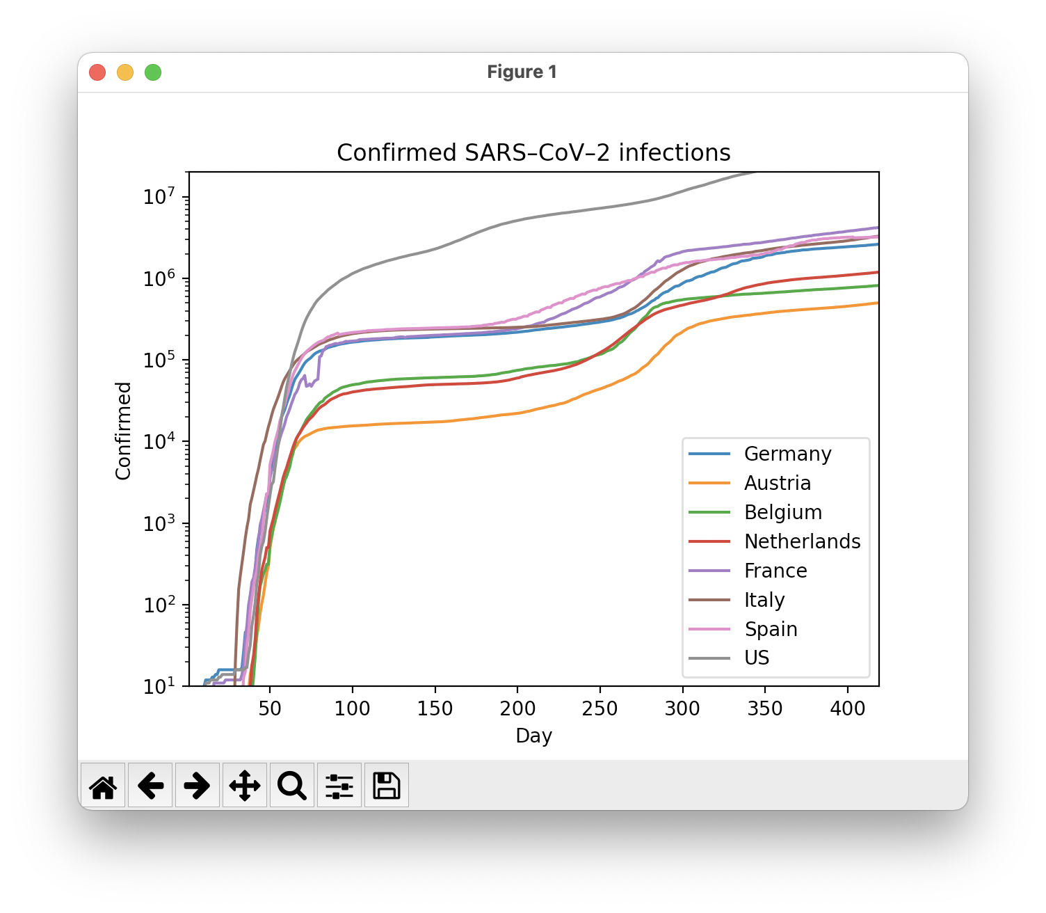
Using GR in Python would be possible, both as a standalone plot package (python-gr) or as a backend for Matplotlib - but a performance gain can not be achieved because the number of points is too small. GR in Python environments only makes sense for large data sets or in real-time applications.
R
Finally, there is a solution in the R programming environment:
Rscript covid19.R
However, for a Julia, Python or MATLAB user, the script may seem a bit cryptic. An opinion about this is up to everyone.
library(tidyr)
library(dplyr)
library(ggplot2)

url = "https://raw.githubusercontent.com/CSSEGISandData/COVID-19/master/csse_covid_19_data/csse_covid_19_time_series/time_series_covid19_confirmed_global.csv"
countries = c("Germany", "Austria", "Belgium", "Netherlands", "France", "Italy", "Spain", "US")

data <- read.csv(url)

confirmed <- data %>% gather(key="date", value="confirmed", -c(Country.Region, Province.State, Lat, Long)) %>% group_by(Country.Region, date) %>% summarize(confirmed=sum(confirmed))

confirmed$date <- confirmed$date %>% sub("X", "", .) %>% as.Date("%m.%d.%y")
confirmed <- confirmed %>% group_by(Country.Region) %>% mutate(cumconfirmed=cumsum(confirmed), days = date - first(date) + 1)

selection <- confirmed %>% filter(Country.Region==countries)
ggplot(selection, aes(x=days, y=confirmed, colour=Country.Region)) + geom_line() +
  theme_classic() +
  labs(title = "Confirmed SARS-CoV-2 infections", x= "Days", y= "Confirmed") +
  theme(plot.title = element_text(hjust = 0.5)) +
  scale_y_continuous(trans="log10")
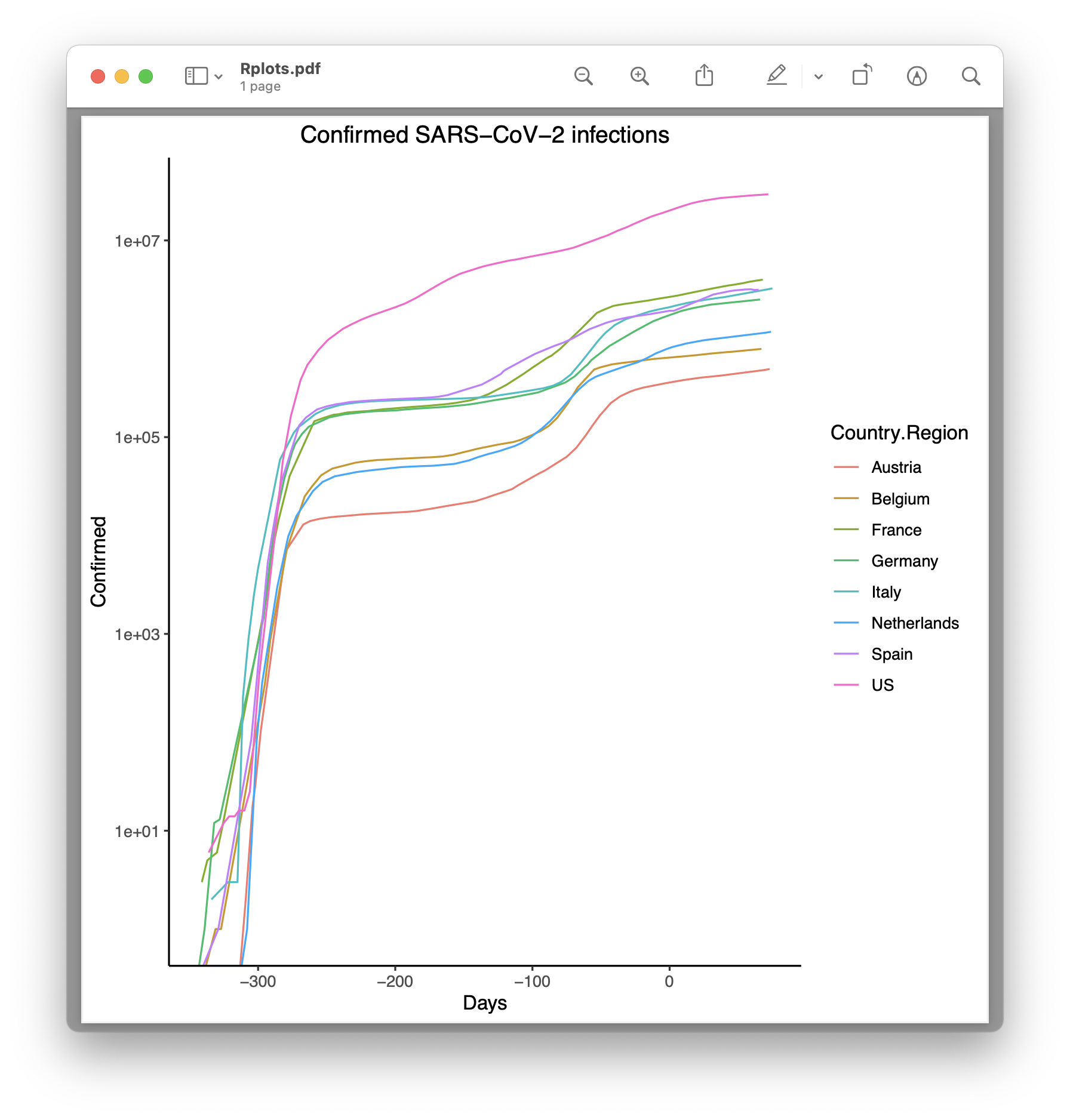
I don’t know enough about R to be able to make the plot output a little nicer.